Categories
Adding and Styling Buttons
Buttons draw attention to an important action
How buttons work
Buttons draw attention to an important action – downloading a form, visiting another page, or booking something – more effectively than a plain text link.
Adding a button
- Click + and add a “Buttons” block (this creates a container that can hold one or more buttons).
- Type your button’s label – keep it short and action-focused, e.g. “Download the form” rather than just “Click here”.
- Select the button and use the link icon in the toolbar to set where it goes.
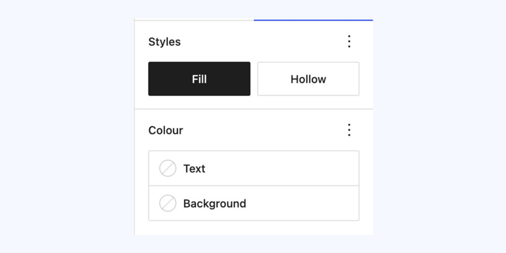
Styling options
With the button selected, open the block settings panel on the right to change its style and colours:
- Style – choose between Fill (the default solid background) or Hollow (an outline of a button with just a border, no background fill).
- Colours – both the background colour and text colour can be changed independently, so you can match the button to your page design. Corner roundness can also usually be adjusted, if your theme allows it.
Tip: Use buttons sparingly – one or two per page. If everything is a button, nothing stands out. If you switch to Outline style, make sure there’s still enough contrast between the text/border colour and the page background so it stays readable.
Conversation
Leave a Reply
You must be logged in to post a comment.
Have you found this useful?
Yes: 0
0
Thanks for the feedback. Let us know what was missing and we will improve this page.
Thank you for your feedback.